Here's a pattern we see in every company we audit: nobody knows what anything costs. Engineers deploy services, scale them up, and move on. The bill arrives 30 days later, and by then it's too late to understand where $80K went.
The fix isn't a better billing tool — it's making costs visible in real-time, in the same dashboards engineers already use. We built a FinOps dashboard with Grafana, Prometheus, and a few custom exporters, and it changed how the entire engineering team thinks about infrastructure.
The Core Problem: Cost Data is Always Late
AWS Cost Explorer shows you what you spent yesterday. Kubernetes has no built-in concept of cost. The result: engineers make resource decisions with zero cost feedback.
Imagine driving a car where the speedometer shows yesterday's speed. That's what managing cloud costs feels like without real-time visibility.
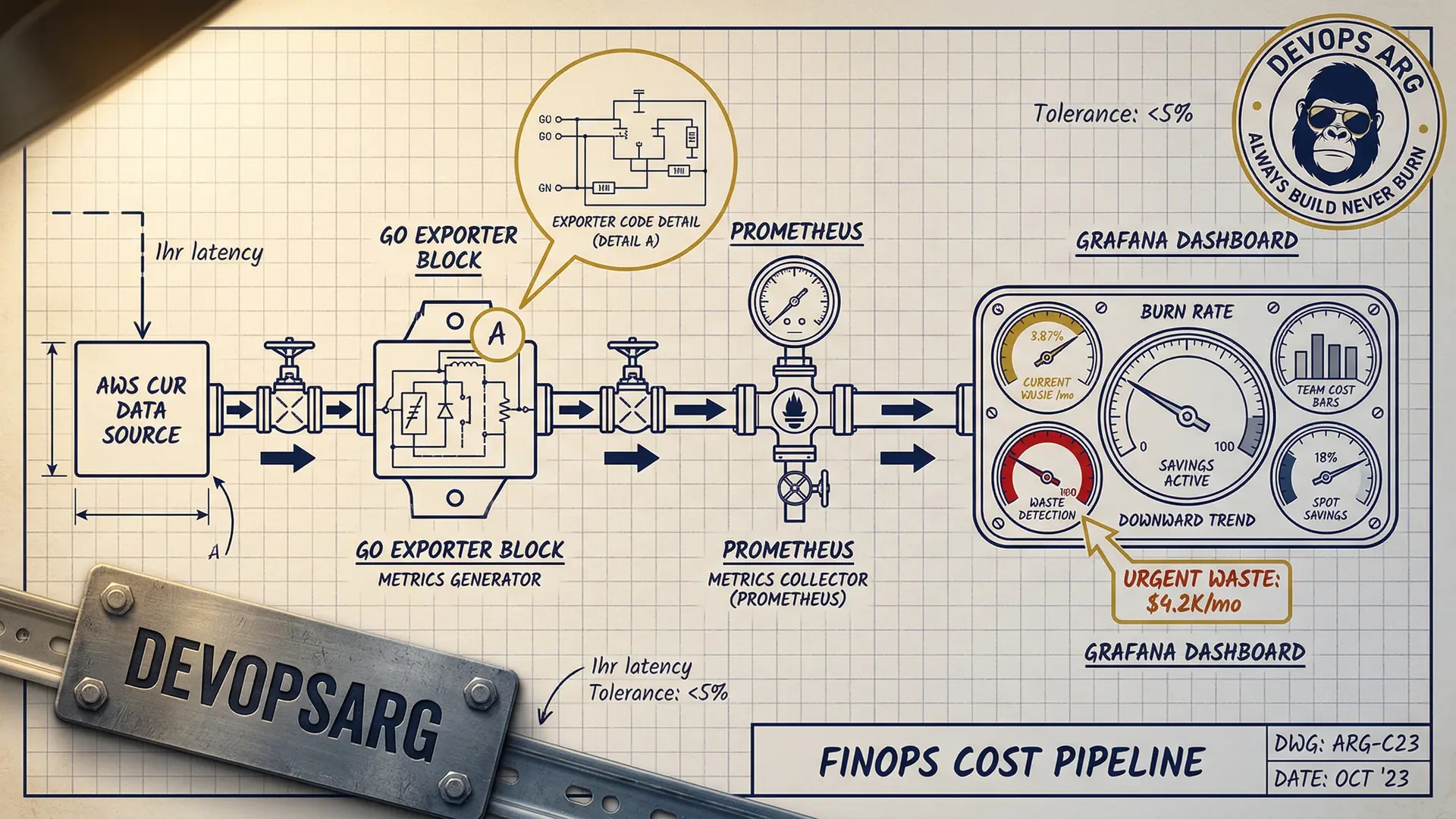
Architecture: Cost Data Pipeline
┌──────────────┐     ┌──────────────┐     ┌──────────────┐
│  AWS CUR      │────▶│  Custom       │────▶│  Prometheus   │
│  (Cost &      │     │  Exporter     │     │              │
│   Usage)      │     │  (Go binary)  │     │              │
└──────────────┘     └──────────────┘     └──────────────┘
                                                  │
┌──────────────┐     ┌──────────────┐            │
│  Kubecost     │────▶│  /metrics     │────────────┤
│  (pod-level)  │     │  endpoint     │            │
└──────────────┘     └──────────────┘            │
                                                  │
┌──────────────┐     ┌──────────────┐            │
│  Spot prices  │────▶│  Spot Price   │────────────┘
│  (AWS API)    │     │  Exporter     │            │
└──────────────┘     └──────────────┘            ▼
                                           ┌──────────────┐
                                           │   Grafana     │
                                           │   Dashboard   │
                                           └──────────────┘
Three data sources feed into Prometheus:
1. AWS Cost & Usage Reports (CUR)
We wrote a small Go exporter that reads AWS CUR data from S3 (updated hourly) and exposes it as Prometheus metrics:
// Simplified — actual exporter is ~300 lines
costGauge := prometheus.NewGaugeVec(
    prometheus.GaugeOpts{
        Name: "aws_cost_hourly_dollars",
        Help: "Hourly AWS cost by service and account",
    },
    []string{"service", "account", "region"},
)

// Scrapes CUR S3 bucket every hour
func updateCosts() {
    records := parseCUR(downloadLatestCUR())
    for _, r := range records {
        costGauge.WithLabelValues(
            r.Service, r.Account, r.Region,
        ).Set(r.BlendedCost)
    }
}
This gives us metrics like:
aws_cost_hourly_dollars{service="AmazonEC2"}→ $12.40/hraws_cost_hourly_dollars{service="AmazonRDS"}→ $3.20/hr
2. Kubecost for Pod-Level Costs
Kubecost allocates cluster costs to individual pods based on resource consumption. It exposes Prometheus metrics out of the box:
# Cost per namespace per hour
sum(
  kubecost_allocation_cost_total{cluster="production"}
) by (namespace)
This is the magic metric — it tells you exactly which team/service is spending what.
3. Spot Price Exporter
A tiny exporter that scrapes current Spot prices from the EC2 API:
aws_spot_price_dollars{instance_type="m5.xlarge", zone="us-east-1a"}We use this to calculate how much we're saving vs On-Demand pricing.
The Dashboard: 4 Panels That Changed Everything
Panel 1: Daily Burn Rate (Big Number)
The most impactful panel is the simplest: a giant number showing today's projected spend.
# Projected daily cost based on current burn rate
sum(rate(aws_cost_hourly_dollars[1h])) * 24
When engineers see "$1,847/day" in bright red, they pay attention.
Panel 2: Cost by Team/Namespace
A stacked bar chart showing cost breakdown by Kubernetes namespace (each namespace = one team):
sum(
  kubecost_allocation_cost_total{cluster="production"}
) by (namespace)
This created healthy competition between teams. Nobody wants to be the most expensive bar on the chart.
Panel 3: Waste Detection
A table showing pods with high resource requests but low actual usage:
# CPU waste ratio: requested vs used
(
  sum(kube_pod_container_resource_requests{resource="cpu"}) by (pod, namespace)
  -
  sum(rate(container_cpu_usage_seconds_total[5m])) by (pod, namespace)
)
/
sum(kube_pod_container_resource_requests{resource="cpu"}) by (pod, namespace)
> 0.7  # More than 70% waste
This panel alone identified $8K/month in wasted resources on the first day.
Panel 4: Spot vs On-Demand Savings
A real-time counter showing cumulative Spot savings:
# Monthly savings from Spot
sum(
  (aws_ondemand_price_dollars - aws_spot_price_dollars)
  * on(instance_type) group_left
  kube_node_labels{label_karpenter_sh_capacity_type="spot"}
) * 730  # hours per month
Seeing "$18,400 saved this month" in green makes everyone feel good about the Spot migration.
Alerts: Cost Anomaly Detection
Dashboards are great, but alerts catch problems faster. We set up three types:
Spike Detection
# Alert if hourly burn rate jumps 50% above 7-day average
- alert: CostSpike
  expr: |
    sum(rate(aws_cost_hourly_dollars[1h]))
    >
    1.5 * avg_over_time(sum(rate(aws_cost_hourly_dollars[1h]))[7d:1h])
  for: 30m
  labels:
    severity: warning
  annotations:
    summary: "Cost spike detected: {{ $value | humanize }}/hr vs normal"
Budget Threshold
# Alert at 80% of monthly budget
- alert: BudgetWarning
  expr: |
    sum(increase(aws_cost_hourly_dollars[30d])) > 12000  # $15K budget * 0.8
  labels:
    severity: warning
Idle Resource Detection
# Alert on pods running but receiving zero traffic
- alert: IdlePods
  expr: |
    sum(rate(http_requests_total[1h])) by (deployment) == 0
    and
    sum(kube_deployment_spec_replicas) by (deployment) > 0
  for: 6h
The Cultural Impact
The dashboard changed behavior more than any policy could:
Before: Engineers never saw costs. Over-provisioning was the default because "it's safer." Nobody optimized because there was no visibility.
After: Every team reviews their cost panel in weekly standups. Engineers started right-sizing proactively because they could see the waste. Three teams independently asked for Spot migration after seeing the savings panel.
One engineer said it best: "I used to think costs were someone else's problem. Now I can see that my service costs $340/day and I know exactly which pods are responsible."
Setup Time and Maintenance
| Component | Setup Time | Ongoing Maintenance |
|---|---|---|
| CUR exporter | 1 day | Minimal (auto-updates) |
| Kubecost | 2 hours | Helm upgrade quarterly |
| Spot exporter | 4 hours | None |
| Grafana dashboards | 1 day | Add panels as needed |
| Alerts | 4 hours | Tune thresholds monthly |
Total: about 3 days of work. The dashboard pays for itself in the first week.
Want a FinOps dashboard for your team? We deploy this stack in under a week. Let's talk.